Profile Pictures Are Not Posters: Designing for the Crop, Not the Canvas

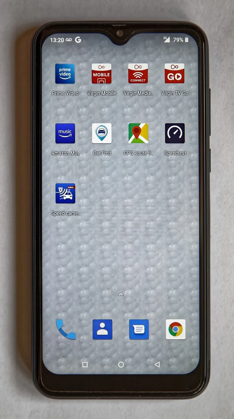
Photo: smartphone displaying social media profile avatar crops on a desk with UK small business branding, via basic-tutorials.de
Most small UK brands treat a profile image like a poster: one carefully composed square, exported once, uploaded everywhere. Then the crops arrive. LinkedIn turns it into a circle, Google Business Profile shaves the edges, Instagram shows a thumbnail the size of a postage stamp and WhatsApp Business reduces the whole thing to a smudge. The design was never the problem. The assumption was.
A profile image is not a single asset. It is a family of tiny visual decisions that have to survive being chopped, rounded, compressed and viewed on a phone in a bus queue. If your brand mark lives in the corner, the circle will find it. If your strapline runs along the bottom, the crop will eat it. This is not a platform conspiracy. It is just how profile images work in 2026.
Start with the worst crop, not the prettiest file
Open your current profile image and look at it as a platform would. Most services apply a circular or rounded-square crop to a square upload. That means the corners are expendable, the outer ring is risky and the centre is precious. A useful exercise is to draw three zones over your master file: a core circle, a middle ring and an outer edge.
Put only the essential stuff in the core: the recognisable part of the logo, the face of the person, the single letter that carries the brand. Use the middle ring for supporting detail that can disappear without causing confusion. Treat the outer edge as decoration. If a key word, a registration mark or a carefully kerned wordmark sits out there, it is already gone on at least one platform.
For team photos, the core is usually the face, not the shoulders or the background. Centre the face and leave breathing room around the head. For logo-led profiles, test whether the mark still reads when the wordmark is removed. Many small brands discover that their full lockup is too wide, so the circular crop leaves them with an odd fragment and a lot of empty background. A compact icon or initial version is often the more honest profile asset.
Test the real surfaces, not a design tool preview
Design software is optimistic. It shows your file at a comfortable size on a large monitor, with clean edges and no interface chrome. The real world is a 48-pixel avatar next to a comment, a Google Business Profile card in a map result or a WhatsApp chat list on a cracked phone screen.
Do a screenshot audit on an actual handset. Upload the image to a test account or a private page, then view it at the sizes the platform uses. LinkedIn company pages, personal profiles and comment avatars all behave differently. Google Business Profile crops aggressively in some placements. Instagram and Facebook are not identical even when they look similar. X, Slack, Teams and email clients add their own little treatments.
A practical test is the two-second squint. Show the profile image to someone who does not know the brand and ask what they can identify. If they say 'a blue shape' when you were hoping for 'Harbour & Sons removals', the safe zone is too tight or the contrast is too weak. Another test is the monochrome test: convert the image to greyscale. If the face or mark disappears, it will also struggle in low-quality thumbnails and dark-mode interfaces.
Do not trust transparency, either. A logo with a transparent background can look elegant in a brand deck and terrible when a platform places it on a grey placeholder or a dark header. Give profile assets a deliberate background colour that works with the platform, not a hopeful void.
Build a small kit, not one heroic master file
Once you have audited the crops, export a compact set rather than forcing one file to do everything. For most small UK brands, five assets are enough: a master square with generous margins, a circle-safe avatar, a compact icon or initial mark, a team-photo crop with the face centred, and a simple wordmark or monogram for places where the full logo is too fussy.
Name them clearly. 'Profile_Avatar_CircleSafe_2026.png' is not glamorous, but it saves a frantic search on the morning of a campaign launch. Keep the master file editable and store the exports in the same folder as your brand fonts and colour references. The point is not to create a design system for its own sake. The point is to stop re-cropping the same bad file every time a new platform appears.
A quick audit before the next campaign
Run through this list before you update a profile, launch a seasonal campaign or hand assets to a new team member:
- The essential mark or face sits inside the central 60% of the square.
- No important text lives near the outer edge or in the corners.
- The image still reads at 32 pixels, 48 pixels and 128 pixels wide.
- It works on a light background and a dark interface.
- The face or mark has enough contrast when converted to greyscale.
- The file has a deliberate background, not accidental transparency.
- The same asset has been checked on LinkedIn, Google Business Profile and at least one messaging app.
- A colleague who does not work on the brand can identify it in two seconds.
None of this takes a large budget. It takes an hour of honest looking and a handful of exports. The circle is not the enemy. The enemy is uploading a poster and expecting it to behave like a passport photo. Design for the crop and the corner stops mattering.