Captions for the Four-Second Glance: A Field Audit for Small UK Video
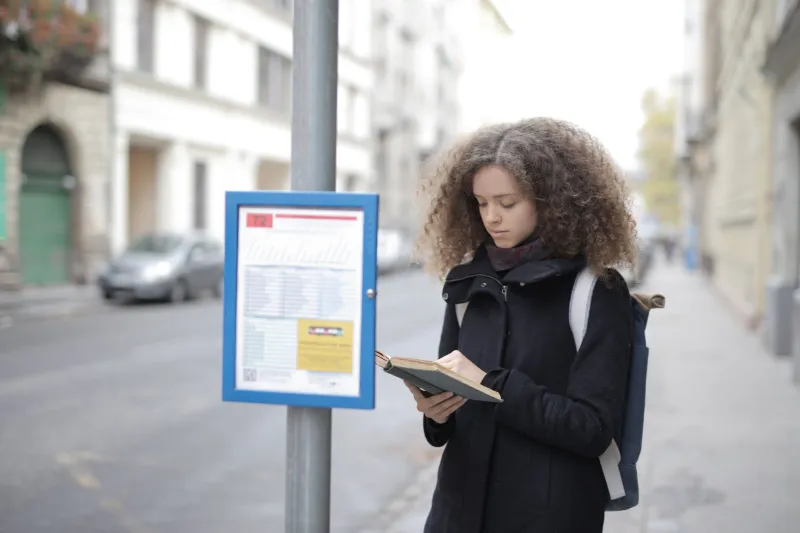
Most small UK brands treat captions as either an accessibility checkbox or a bit of visual seasoning. In reality, they are the part of the video most people actually read. Your customer is not sitting in a dark cinema with a bucket of popcorn. They are on the top deck of a bus, in a Tesco queue, or waiting for the kettle to boil, holding a phone at arm's length with the sound off.
That is the viewing condition to design for. Not the pristine preview window on your laptop. A single 15-second clip can tell you more about your caption styling than an hour of fiddling with fonts in an editor.
Start with one clip and one uncomfortable viewing position
Pick a representative 15-second cut from your next campaign. Export it as you normally would, captions included, at the size you actually post: 1080x1920 for vertical, 1080x1350 for feed, 1920x1080 for landscape. Do not test with a specially designed caption showcase. Test with the real thing, busy footage and all.
Now watch it on a phone at roughly arm's length. Then watch it again standing by a window in daylight. Then watch it while walking slowly around the kitchen. Keep the phone at around 60% brightness. This is not a scientific study; it is a reality check. Note the moments you have to stop reading to keep up, the words that disappear into a patterned coat, and the captions that sit under the platform's own interface.
If you miss more than two or three words in 15 seconds, the style is not working for a glance.
The numbers that matter more than font fashion
Caption design is full of opinions. These are the few settings worth settling first.
- Type size. On a 1080-wide vertical video, start around 40–48 pixels and test down, not up. If a colleague has to squint at arm's length, it is too small. Thin weights look elegant in the editor and vanish on a moving bus.
- Line length. Aim for roughly 28–32 characters per line, with no more than two lines on screen at once. Long lines force the eye to travel; short lines keep the phrase together.
- Contrast. Do not rely on white text alone. Aim for a solid or semi-solid backing plate, or a strong shadow, so captions survive against the busiest frame. Check the busiest shot, not the calmest one.
- Safe zones. Keep captions out of the bottom 15–20% of vertical video, where platform buttons and swipe bars live. Leave the top 10–12% alone too, and give the sides a little breathing room. Captions tucked under the UI are captions nobody finishes.
- Timing. Break captions into phrase chunks of two to five words, held for around 1.5–3 seconds. Word-by-word karaoke is exhausting to read and makes every clip feel like a quiz.
These are starting points, not commandments. The point is to choose defaults deliberately, then test them against real footage.
Read the footage, not just the transcript
Captions do not sit on a blank canvas. They sit on movement. A busy market stall, a striped shirt, a window full of reflections and a flurry of confetti will all eat a delicate caption alive.
Play the clip muted and watch where your eye goes. If the caption crosses a face, a product label or the main action, move it. If the text blends into a pale wall or a grey UK sky, add a backing plate rather than cranking the font weight. If the footage is very busy, consider a slightly more opaque background. A plain dark strip is not stylish, but it is honest, and honest beats illegible.
Daylight matters too. British winter light can flatten contrast and make white text on a light background look washed out. Test outdoors in November 2026 light, not just under office fluorescents. The difference is not subtle.
Build a one-page caption style sheet
Once you have tested a few clips, write down the rules. A one-page style sheet stops every new video becoming a fresh debate. It can be as simple as this:
| Element | Default | When to break it |
|---|---|---|
| Typeface | Clear sans-serif, medium or semibold | Almost never |
| Size | 40–48px on 1080-wide vertical | Longer viewing contexts, such as website embeds |
| Colour | Off-white text on a dark backing plate | Brand colour only if contrast passes |
| Line length | 28–32 characters, two lines maximum | Very short punch phrases |
| Placement | Centre-lower, above platform UI | When it covers a face or key product detail |
| Timing | Two to five words per chunk, 1.5–3 seconds | Fast dialogue, split more carefully |
| Emphasis | One accent word or colour per clip | Never as a default |
Add a line for your own brand: no more than one all-caps word per clip, no emoji in the middle of a sentence, and no caption that needs a second read to make sense.
The bus-stop version of quality control
The final check is not a aesthetic one. It is a behavioural one. Watch the clip muted, in daylight, while standing up. Ask a colleague to do the same without context. If they can follow the first three seconds without asking what the video is about, the captions are doing their job.
This is particularly important in the UK, where public transport and shared spaces make muted viewing the norm. Nobody wants to be the person blasting a brand video on the 42. Design for the quiet, hurried glance and the sound-on viewer still gets a better experience.
Captions are not decoration. They are the smallest, most-read piece of typography your brand puts into the world. Give them a proper test, a short style sheet and a safe zone, and they will keep working long after the campaign has moved on.