The Invoice Clients Actually Keep: A Visual Polish Checklist for UK Small Businesses
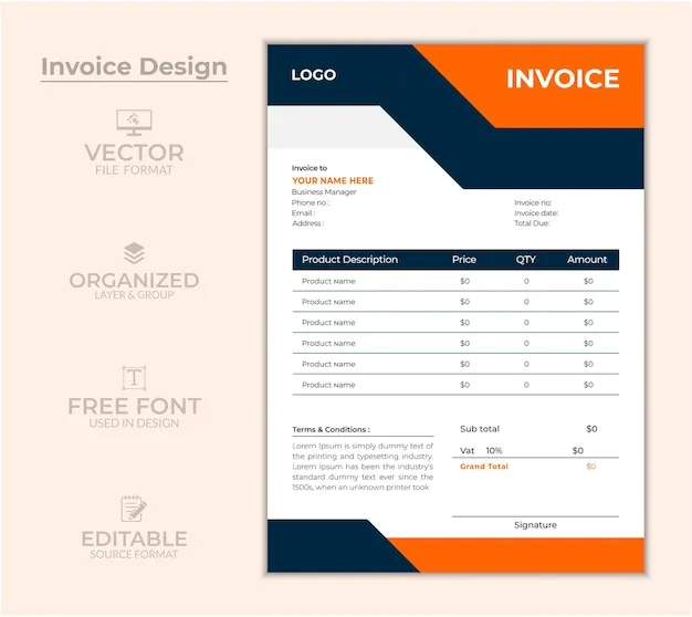
Photo: invoice document branding stationery flat lay UK, via img.freepik.com
Opinion: most small UK businesses would not dream of sending a customer to a website with a stretched logo and mismatched fonts. Then they send an invoice with exactly that. The invoice is not glamorous, but it is one of the few documents a client keeps, forwards to a finance team, or opens when they are about to pay you. That makes it a brand asset. It deserves more than the default template.
The document is part of the experience
Quotes, proposals, onboarding packs and invoices are touchpoints. They arrive at moments when trust matters: before a project starts, during a handover, or when someone is deciding whether to pay promptly. A clear, well-set document reduces friction. A messy one creates a small doubt. Will this supplier be easy to deal with? Will the VAT number be right? Why is the logo blurry?
This is not about turning an invoice into a design portfolio. It is about visual polish that supports clarity. Fancy fonts and coloured panels can make a document harder to read. The aim is a document that looks considered, not decorated.
Typography that survives the export
Custom fonts are lovely until a PDF export substitutes them. If you use a brand typeface, embed it or test the exported file on another machine. If embedding is not possible, choose a reliable fallback and use it consistently. A clean sans-serif for headings and body text is usually enough. Keep the hierarchy obvious: business name, document title, client details, line items, totals. Avoid tiny type. If a client has to zoom in to read a line item, the layout is too tight.
Use UK spelling in client-facing copy, and keep dates unambiguous. A document dated 08/11/26 can be read differently by an international client. Write 8 November 2026 or use a clear format. Small details like this signal care.
Logo sizing and clear space
A logo should look at home, not inflate to fill the header. Use a vector file where possible, or a high-resolution PNG at the size you actually need. Keep the clear space around it. Do not stretch it, recolour it casually, or place it on a busy photograph. On an invoice, a modest logo with the business name and contact details is usually more trustworthy than a giant mark.
If you have a dark logo, check it against the document background. A dark mark on a dark header will disappear. Keep a light-background version for documents and a dark-background version for screens.
Colour behaviour in exported PDFs
Colour can shift when a PDF is exported, especially if transparency, spot colours or images are involved. A brand colour that looks rich on your monitor can print dull or appear fluorescent on a phone. For documents that will mostly be viewed on screen, test the PDF on a phone and a desktop. For anything that will be printed, ask your print supplier about colour profiles before you send a batch.
Also check contrast. Pale grey text on white may look elegant in a design file but fail on a laptop screen in a bright office. Accessibility is not a niche extra. Clear contrast helps everyone, including the client reading your invoice on a train.
File names, links and accessibility
The file name is part of the impression. Invoice_Final_Final_2.pdf tells the client nothing. Use a predictable pattern such as ClientName_Invoice_2026-11.pdf. It is easier to search, easier to file and less likely to be confused with another document. Keep personal data out of file names where you can.
Accessibility matters here too. A scanned invoice is just a picture to a screen reader. Export a tagged PDF with real text, a sensible reading order and alt text for any meaningful images. Use descriptive link text rather than 'click here'. If you send a quote as a PDF, make sure the contact details and totals are selectable text, not baked into an image.
A checklist for your next client-facing document
- Use one heading font and one body font, with clear sizes.
- Embed fonts or test the PDF on another device.
- Place the logo at a sensible size with clear space.
- Check the logo and text contrast on screen and in print.
- Export a tagged, text-based PDF rather than a scan.
- Name the file with client, document type and date.
- Write dates and currency clearly for a UK audience.
- Test the document on a phone before sending.
None of this takes long. It just moves the document from admin afterthought to brand touchpoint. Clients may not compliment an invoice, but they notice when it is clear, calm and consistent. In a small business, that quiet consistency is worth more than a flashy template.