Nobody Sees Your Newsletter: They See Three Lines and a Sender Name
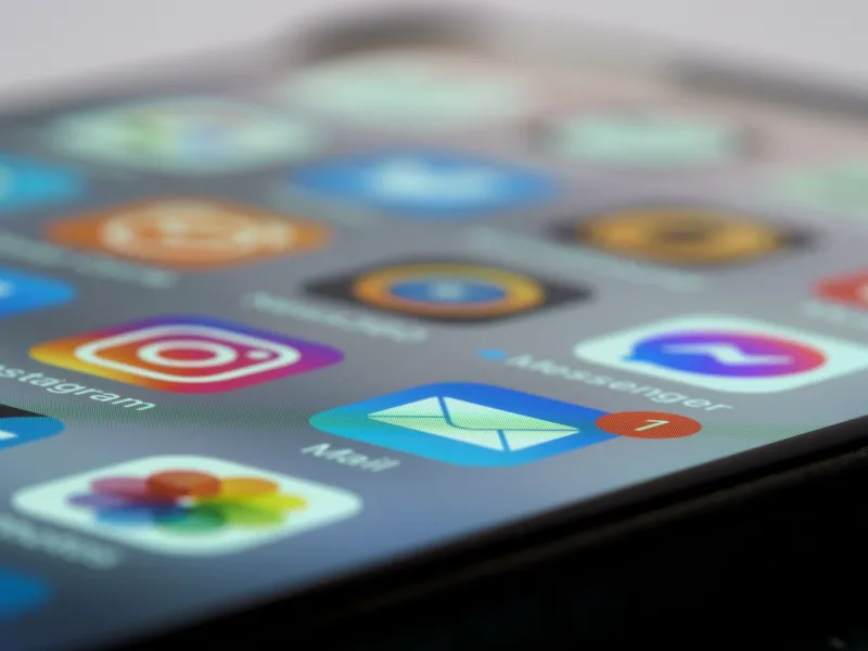
Here is how I decide whether to open a newsletter. I glance at the sender, half-read the subject, catch a fragment of grey preview text underneath, and in roughly a second and a half I have decided. I am not unusual. Neither are your subscribers.
This is the uncomfortable bit for small brands: the email you spent a fortnight designing is not what people are judging. They are judging a compressed, text-only shadow of it, rendered in a font you did not choose, on a screen you cannot control, in a list next to thirty competitors and a delivery notification. If the design work happens after that decision, most of the design work is wasted.
The inbox is the landing page, and you do not own it
Most UK small brands I see have an inverted budget. Serious effort on the template, the hero image, the campaign grid. Almost none on the sender name, which is often whatever the CRM defaulted to, and the preheader, which is often left empty so the client scrapes the top of the HTML and displays 'View this email in your browser' to every subscriber on the list.
That single line of scraped text is probably the most-seen sentence your brand writes all year. It should not be a housekeeping notice.
Treat the sender name as a brand mark
The sender name is the first thing rendered and, on a phone, often the boldest. It also truncates brutally. 'The Cotswold Soap Company' becomes 'The Cotswold Soap Co…' on a narrow screen. 'Cotswold Soap' survives intact.
So decide a short form deliberately, the way you would decide a favicon — short enough to survive a 20-25 character cut, consistent across every send, and recognisably yours rather than 'Marketing' or 'Newsletter'. If your CRM lets you set a display name that differs from the from-address, use it. Nobody has ever opened an email because the sender was noreply@.
Worth knowing: the little logo some brands get beside their name in Gmail relies on BIMI and, in practice, a paid verification certificate. It is a nice-to-have for larger senders and not a realistic 2026 priority for a five-person business. Consistency of name does far more work for far less money.
Subject and preheader are one sentence, split in two
Treat them as a pair, not as headline plus subtitle. The subject sets up a thought; the preview text finishes it, or deliberately turns it. Write them together, in one sitting, and read them together on a phone.
Practical constraints worth respecting:
- iOS Mail typically shows around two lines of preview; Gmail shows the subject plus a snippet; some clients show almost nothing
- Keep the visible preheader to roughly 40-60 characters before the padding trick hides the rest
- Put the preheader as the first real text in the HTML, above the logo, hidden from the body with the usual CSS padding and zero-width characters
- Never leave it blank, or the client will scrape your navigation links and alt text instead
A useful exercise: cover the email entirely and read just the sender, subject and preview out loud. Does it sound like a person with something to say, or a system with something to announce? Most small brands discover the latter.
The header image is a crop, not a banner
If your header is a designed banner with the headline baked into the pixels, three things go wrong at once. It crops differently in every client. It never appears for anyone with images switched off, which on Outlook desktop is most people in most UK offices. And it cannot be read out, searched or quoted.
Live text over a photograph is the safer pattern, with the photograph generous enough to lose 20% off the top and bottom without losing its point. Keep any baked-in words short, central and far from the edges. If the headline must live inside the image, make sure the same words appear as live text immediately below it.
Alt text is copy, and it is read by humans
Alt text is not an accessibility checkbox to satisfy at the end; it is the sentence that appears when the image does not. Write it as a short, plain description of what the image is doing — 'Two bars of soap on a tiled windowsill, morning light' — and do not duplicate the headline that sits beside it. Never 'image1.png'. Somebody with images off, a slow Cornish connection, or a screen reader is reading exactly what you typed.
Design the first screen, not the whole scroll
On a mid-range phone, above the fold is roughly 500-600 pixels. That is your shop window. If it contains a logo, a waving-hand illustration and the words 'Hello and welcome', the point of the email has not made it into view.
Put the offer, the new product or the reason for writing inside that first screen. Save the greeting for people who have already scrolled, which is a much smaller number than you think.
A five-minute pre-send check
- Send it to yourself and look at the list view before opening — sender, subject, preview, nothing else
- Screenshot the sender name on a narrow phone; check the truncation is not embarrassing
- Read subject and preheader together as one continuous sentence
- Switch images off in Outlook, or use an image-off preview, and see what remains
- Check dark mode, where inverted backgrounds can swallow dark text and pale logos
- Hold the phone at arm's length and see whether the first screen still communicates
- Ask a colleague who has not seen it to describe, in one sentence, what the email is about without opening it
- Confirm the unsubscribe link and registered company details are present and legible, as UK rules require
That is five minutes against a fortnight of layout work. Do the five minutes first — the layout will have something worth wrapping around.