The Thumb Owns the Screen: A One-Handed Checkup for Your Mobile Shopfront

Photo: Wil540 art, CC BY 4.0, via Wikimedia Commons
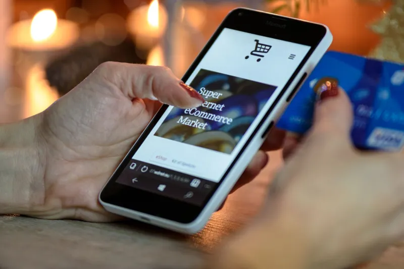
Picture the scene: the Northern line at half eight, a coffee in one hand and a phone balanced in the other. Somebody has tapped through from an Instagram story to your shop. They've got one free thumb and about eight seconds of patience before the tunnel eats the signal. Whatever your mobile layout looks like in a 1440px artboard, this is the version that actually counts.
The held-thumb test isn't a plugin or a paid tool. It's a habit: pick up a real phone, hold it the way a customer would, and try to buy something using one hand only. What you find is rarely a design disaster. It's usually a small pile of fixable frictions — a basket icon sitting under the pad of your thumb, a sticky bar stacked on two others, a "Continue" button a hair too close to "Edit". None of it shows up on a desktop mockup. All of it shows up in your completion rate.
Start With the Hand, Not the Artboard
Design software gives you a flat rectangle and a polite little cursor. Real hands give you a thumb, a palm and a grip. On a typical handset, the pad of the thumb sweeps a comfortable arc across the bottom third and lower middle of the screen. The top corners — where a great many brands park the basket, the menu and the search field — live in the stretch zone. Reachable, but only by shifting your grip, and shifting your grip is the exact moment someone remembers they were meant to be doing something else.
So before you change a single pixel, run a plain inventory. Which of your five most important actions can be reached without adjusting your hand? If the honest answer is "none of them", you've just found your first piece of work.
Measure the Gaps, Not Just the Icons
The received wisdom is that tap targets should be around 44 to 48 pixels square. Treat that as the floor rather than the finish line. The real trouble is proximity. A "Buy now" button sitting six pixels above "Save for later" is technically compliant and practically a trap — and it's the sort of thing that generates a support email beginning "I didn't mean to order two".
Give adjacent actions visible breathing room. Eight to twelve pixels is a sensible minimum between targets that do genuinely different things; more if one of them spends money. Where you can, push secondary actions further down the page or behind a quieter treatment. Nobody has ever abandoned a basket because the "remove" link was too far from the "add a note" link.
Count Your Sticky Things
Open your own site on a phone and tally up everything that refuses to scroll: the header, the promo strip, the cookie banner, the chat bubble, the app-install nag, the back-to-top button, the sticky add-to-basket bar. Individually, each one is defensible. Stacked, they can hand a third of a small screen to furniture.
A useful rule: one sticky element is a feature, two is a negotiation, three is a wall. If your sticky header plus sticky cart bar leaves the product photo looking like a letterbox, you've made the page feel busy without making it feel clearer. Collapse what you can on scroll, and be ruthless about anything that only exists because someone in a meeting liked it.
One Job Per Screen
A mobile checkout that offers "Continue shopping", "Apply a discount" and "Pay now" with equal visual weight is asking the customer to make a decision at the exact moment they wanted to make a payment. Decide which single action the screen exists for, put that inside the thumb arc, and let everything else recede. Visual hierarchy is not decoration — it's the difference between a shopper who finishes and one who hesitates long enough to remember they're hungry.
The Accidental-Tap Walkthrough
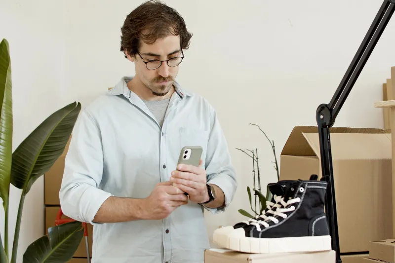
This is the part that only works with bodies in the room. Borrow three phones: something small and older, a standard-size handset and one of the very large ones. Ask three people — ideally with different hand sizes and at least one left-hander — to complete a purchase one-handed while you watch. Don't guide them. Just note where the mis-taps land, where they pause, and where they shift their grip.
A few things reliably surface. Phone cases and screen protectors shrink the usable edge. Modern gesture bars and browser address bars eat swipes near the very bottom, so a button flush to the lower edge competes with the operating system. Winter gloves, a phone in the weaker hand, a cracked screen — all of it changes the picture. And somebody will always tap the wrong thing because two elements looked identical at arm's length.
Test Like a Customer, Not a Designer
Your office has good wifi and a desk. Your customer has a bus, a queue, a bright window and a two-year-old handset. Run at least one pass under those conditions: standing up, walking slowly, bright light, throttled connection. Load the page cold rather than from cache. Watch how the layout behaves before the images arrive, because that's the version a lot of people see first.
Small Fixes, Not a Redesign
Almost everything the held-thumb test uncovers can be fixed in a stylesheet, not a rebrand:
- Move the primary call to action out of the top corner and into the thumb arc.
- Add padding around tap targets without changing how big they look.
- Increase the gap between adjacent buttons that do different jobs.
- Cap sticky elements at one or two and let the rest scroll away.
- Demote secondary actions with weight, colour or position rather than hiding them.
- Give irreversible actions — delete, cancel, pay — extra separation and a confirmation step.
- Keep the basket reachable but clear of the scroller edge and the OS gesture zone.
The Confidence Question
None of these changes will make a screenshot look dramatically better in a pitch deck. That's rather the point. On a phone, friction reads as untrustworthiness: a stray tap, a button you have to shuffle your grip to reach, a page that feels crowded at the bottom. Tidy those up and the shop simply feels more competent, which is most of what a small UK brand has to work with when it's competing against somebody with a bigger design budget.
Grab a phone. Hold it in one hand. Try to buy your own product. Whatever annoys you in the first thirty seconds is your next week's work — and it's cheaper than a redesign.