The Wrong Door Test: Making Your Shop’s Accidental Arrivals Feel Intentional
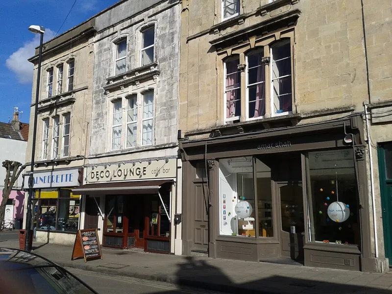
Photo: Virginia Knight , CC BY-SA 2.0, via Wikimedia Commons
Most small UK shops spend their design budget on the pages people are meant to see. The homepage gets the hero image. The product page gets the photography. The checkout gets the trust badges. Then someone taps an old Instagram link, mistypes a URL or searches for a product you stopped stocking in 2024, and lands on a page that looks like the lights have been switched off.
That is the wrong-door problem. The accidental arrival is still a brand moment. It is often the first time a customer sees your shop after a recommendation, a flyer, a forwarded message or a late-night search. If the page says nothing useful, they do not think ‘ah, a minor technical issue’. They think the shop is abandoned, careless or closed.
Why a wrong turn is still a shopfront
A visitor does not arrive with a map of your site. They arrive with an intention. They wanted a specific product, an offer they saw last month, or the page a friend sent them. When that intention meets a default server error, the visual message is blunt: nobody checked this bit.
For a small UK brand, that matters more than it does for a giant retailer. You are not competing on endless inventory. You are competing on care, clarity and the feeling that a real person is behind the shop. A well-designed accidental arrival page can protect that feeling in about ten seconds.
It does not need to be a masterpiece. It needs to be clear, on-brand and useful. Think of it as the digital equivalent of a staff member saying: ‘That aisle has moved — come this way, I’ll show you.’
Start by finding the doors nobody labelled
The uncomfortable part of this audit is that you have to go looking for failure. Set aside an hour and collect the accidental arrivals your shop already creates. Useful places to start:
- Type a random string after your domain, such as yourshop.co.uk/blue-jumper-old.
- Search your own site for something odd, vague or misspelled.
- Open an old campaign link from a previous email or social post.
- Visit a product page for something you no longer stock.
- Check a category page that currently has no items.
- Follow every link in your Instagram bio, email footer and any printed QR codes still in circulation.
- Look at your analytics for 404 reports and internal search terms with no results.
Take screenshots on a phone, not just a desktop. Most of these arrivals will happen on mobile, often on a patchy connection, often while someone is walking or commuting. A page that feels tidy on a 27-inch monitor can become a confusing stack of text on a 360-pixel-wide screen.
Tone: clear first, charming second
The default 404 often swings between two extremes. One is a cold server message. The other is a jokey illustration with a cartoon robot and no route back to the shop. Neither helps.
Start with plain English. Say what has happened, briefly. Then offer the next step. A little personality is fine, but it should not delay the useful bit. Something like: ‘That page has moved, or it never existed. Let’s get you back to something useful.’ That is warmer than an error code and faster than a paragraph of whimsy.
Apologise once, if you like. Do not grovel. Do not blame the visitor for a typo. And avoid the fake-cheerful tone that makes a broken link feel like a personality flaw. The goal is reassurance, not comedy.
Layout: one job per accidental arrival
These pages are not the place for a complicated layout. Give the visitor one clear heading, one short explanation and a small set of routes forward. Keep your normal header, logo, colours and typefaces so the page still feels like your shop. A branded dead end is still better than an unbranded one.
On mobile, put the helpful stuff high. A giant illustration that pushes the search bar below the fold is a design choice that punishes the visitor for arriving by mistake. Use a simple stack: short message, search box, three or four links, contact route. Buttons should be easy to tap with a thumb, with enough contrast to read in daylight.
If you run a service business rather than a product shop, the routes may be different: see what you do, read a case study, book a call, email us. The principle is the same. Give people a way to continue, not just a way to admire your brand colours.
Empty search results are a conversation
An empty search page is one of the most overlooked screens in small ecommerce. Someone has told you exactly what they want, and the site replies with ‘No results’. That is a dead end dressed up as a feature.
Show the search term back to them so it is clear what was searched. Offer spelling suggestions, popular categories or a few products that are close. Keep the search box filled in so they can adjust the query without starting again. If appropriate, add a line like: ‘Can’t find it? Message us and we’ll check.’ For a small UK shop, that human route is often more valuable than a clever algorithm.
Expired promo links need a soft landing
Seasonal campaigns are a common source of accidental arrivals. An old Black Friday link, a finished free-delivery offer or a discontinued bundle can keep circulating in group chats and bookmarks long after the page has gone.
Do not dump everyone on the homepage with no explanation. That feels like a bait-and-switch. Explain that the offer has ended, then show what is current: a related collection, a similar product, the latest promotion or a newsletter sign-up for the next one. If the campaign page is seasonal, replace it with an evergreen hub rather than deleting it and leaving a hole.
Out-of-stock pages should not look broken
An out-of-stock product page is another accidental arrival, especially when it is linked from an old review or social post. The visitor is not necessarily lost — they are interested. Do not greet them with a greyed-out button and nothing else.
Keep the product image, name and key details visible. State availability clearly. Offer a notify-me option if you have one, plus sensible alternatives. A disabled button with no explanation feels like a closed door. A short line — ‘Back in stock in early December’ — plus two similar items feels like a shop that is still trading.
Small decisions that keep trust
A few details separate a polished accidental arrival from a template default. Make sure the page returns the correct technical status, even if it looks lovely. Avoid automatic redirects that whip people to the homepage before they can read what happened. Test the search box on the page itself. Check that your contact link opens an email app or a form that actually works. And make sure the page does not rely on an image to explain the situation.
A simple audit you can run this week
Open your shop on a phone and deliberately get lost. Try a broken URL, an empty search, an old promo link and an out-of-stock product. For each one, ask four questions: Is it clear what happened? Does it still look like us? Is there an obvious next step? Would a customer feel reassured enough to keep browsing?
If the answer is no, you do not need a redesign. You need a short, branded page with a plain-English line, a search box and a few useful routes. The wrong door does not have to be a dead end. With a little care, it can still be a front door.